Diagonal
Scrolling Cards

Documentation

Module Fields

scrollcardsfields
Content

The module can contain any number of cards. By default, two cards are added. If you only need one card, simply delete one of the default cards.

Each card includes the following content fields: Title & Description. If either field is left empty, it will not be displayed in the card. This is useful when you want to show only one of these fields.

Use the Link field to assign a URL to the card.

The link can be applied in different ways: button or entire card. You can also disable links completely. This setting is available under Style > Card.

The Image Lane 01, Image Lane 02, and Image Lane 03 fields contain the images used in the diagonal moving lanes. Each lane must contain at least 4 images.

Styles

All appearance settings are grouped under the Style tab.

In Style > Text, you can configure the typography used in the module. This includes text size, color, and other text styles, allowing you to adjust the appearance of the title and description to match your design.

In Style > Card, you can configure the visual appearance and behavior of the card itself. This section includes settings for the background color, overlay color, link type, hover effects, and other card-related options. The card height is defined in vw (viewport width), which means it is based on the browser window width. You can also limit the maximum card height using the Max Height field and define a separate height for mobile devices using the Mobile Height field.

In Style > Button, you can configure the button styles. These settings are only applied when the selected link type is Button.

Image Optimization

In the Image Optimization tab, you can optimize uploaded images by resizing them based on width. This allows you to upload larger images and automatically compress them to the specified dimensions, which helps improve your website’s performance. Separate settings are available for standard and retina displays. Please note that inside the card, images will always fill the full width of the lane regardless of the specified resize values.

Full Width Layout

hover-box-docs01
Edit Section and Columns

Click on the icon 'Pencil' to start edit Section and Columns.

hover-box-docs02
Section settings

Set Content alignment to Full Width and all paddings equal to 0px.

hover-box-docs03
Columns settings

Set left and right paddings equal to 0px for each column in the row.

Need help building your custom website?

Get a custom HubSpot website built using this theme — fast, flexible, and tailored to your needs.
Start Project Custom modules and advanced
functionality are also available.

Our Themes

marketHome06 sectionScroll12 horizontalSec01 sectionScroll05
home02 sectionScroll02 section29 sectionScroll09-1
sectionScroll10-1 pitch02 pitch12 pitch11

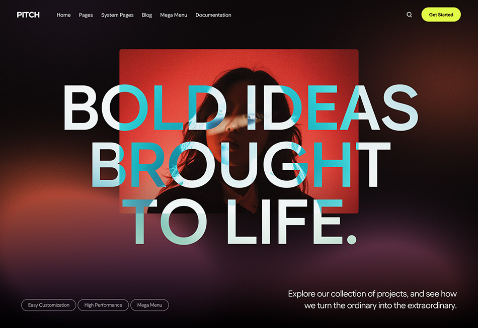
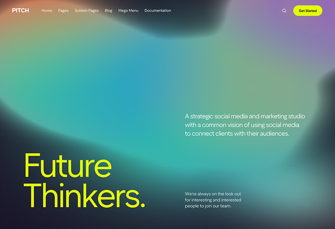
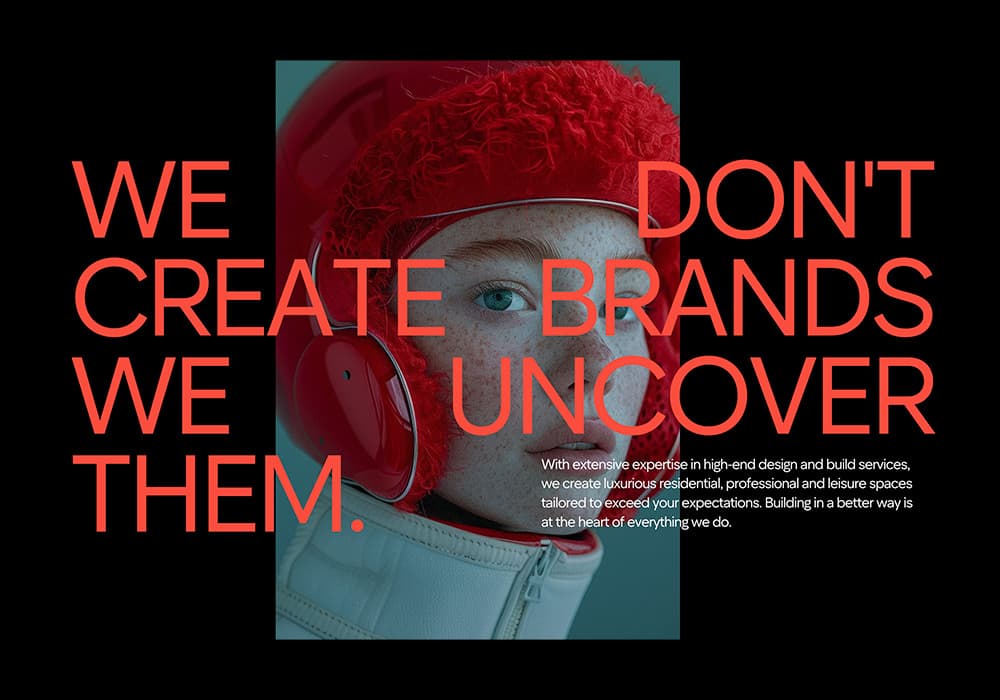
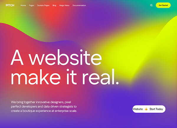
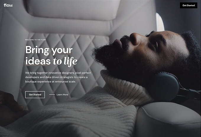
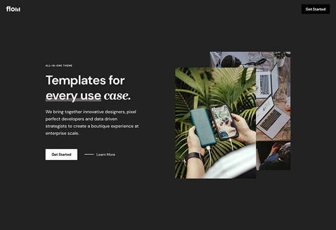
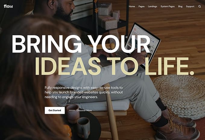
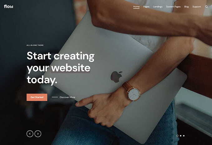
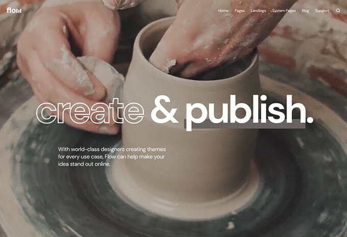
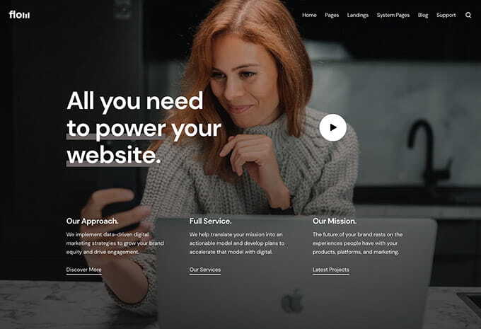
A modern theme with a bold design, customization, and a library of templates, modules, and sections—perfect for startups, agencies, and personal websites.
Live Demo
landing01 home13 landing02 landing04
home06 home01 home14 home04
home03 landing03 home09 home08

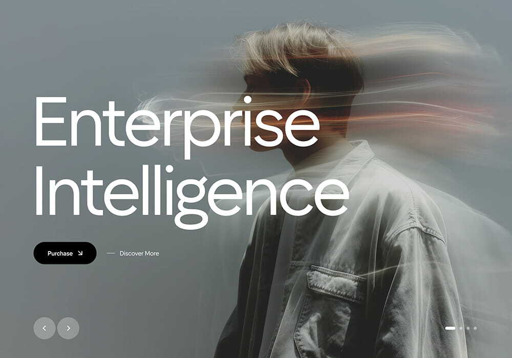
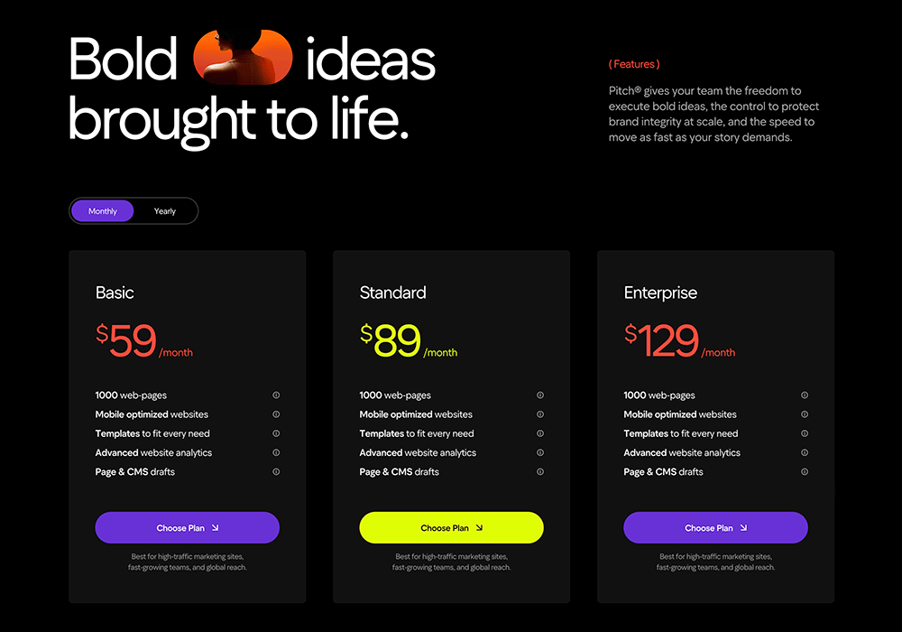
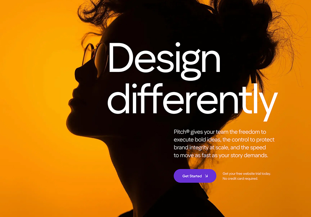
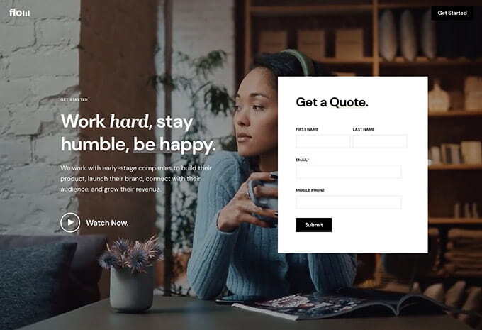
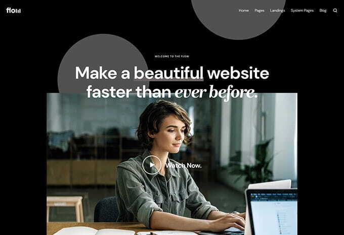
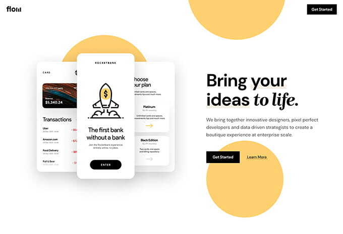
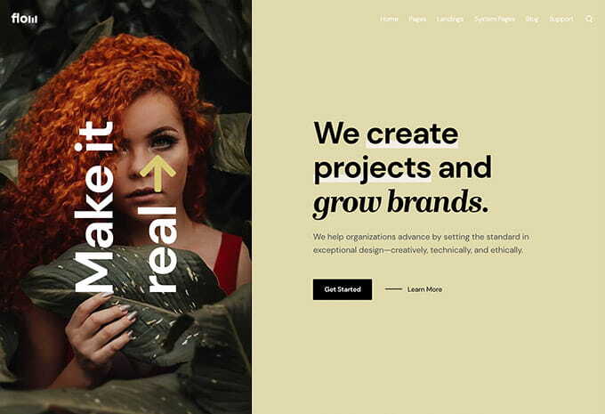
Flow features a modern, stylish design with advanced tools and flexible features to build beautiful websites—perfect for a wide range of businesses and use cases.
Live Demo