Hover Box
Documentation
Module Fields


Background Type
Choose background type: image or solid color. Combine different types to get unique layout.

Height Control
Set height size for desktop and mobile devices. For desktop you can choose size unit: px, vm, vh, vmax.

Color Control
Set color and opacity for overlay to get more text contrast. Use field Text Color to change text color.

Tag Control
Set tag for Title and Subtitle. The size depends on your theme settings. We recommend choosing H4-H6.
Full Width Layout


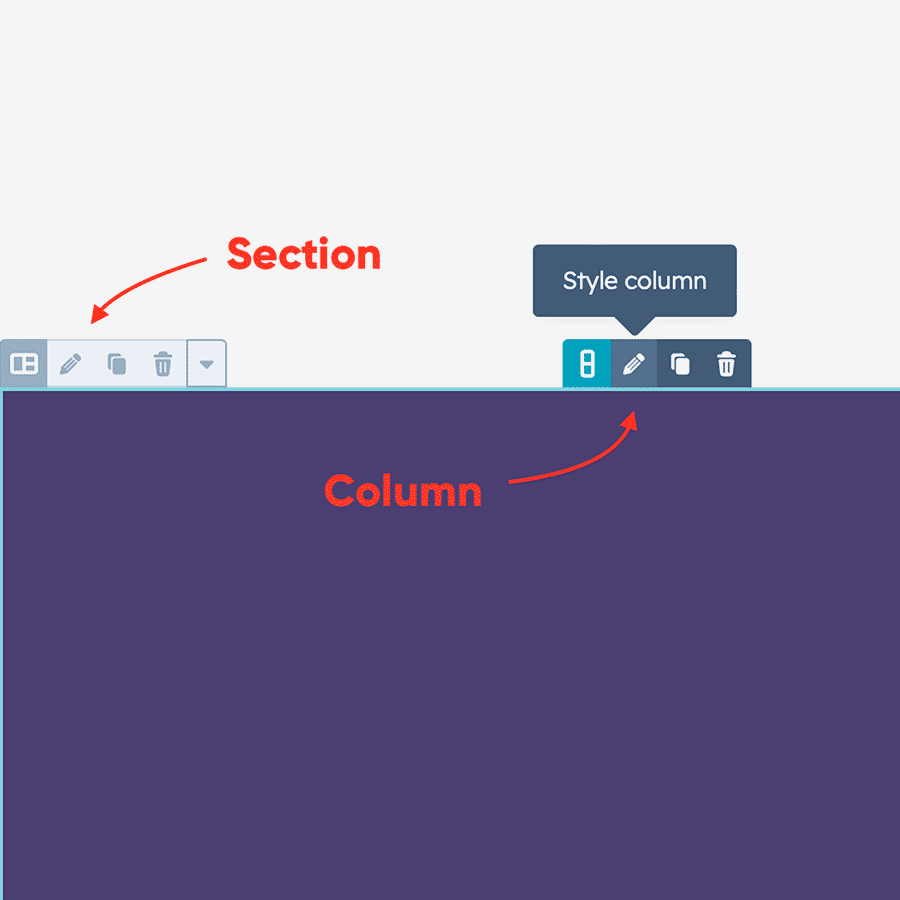
Edit Section and Columns
Click on the icon 'Pencil' to start edit Section and Columns.

Section settings
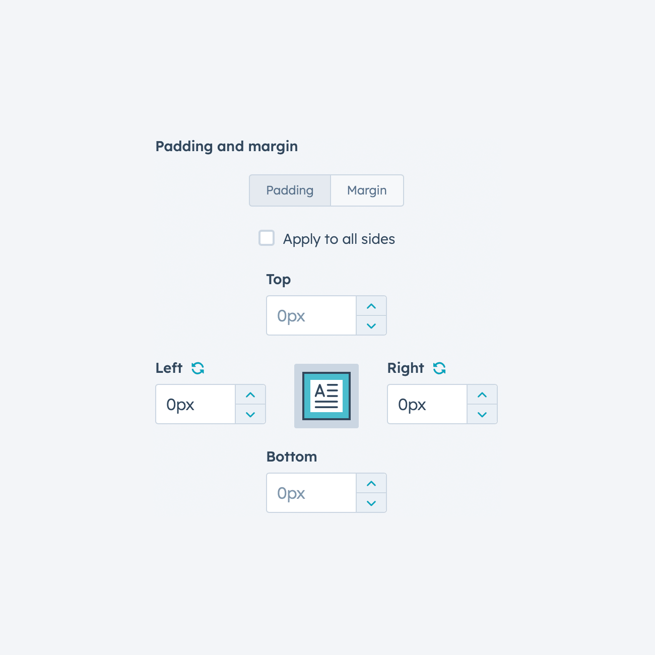
Set Content alignment to Full Width and all paddings equal to 0px.

Columns settings
Set left and right paddings equal to 0px for each column in the row.
Recommendation
Some themes do not allow you to remove the space between columns. You need to enable the toggle [Module settings > Styles tab > Remove gap between columns] for each module in the row to fix it.

